
UX/UI Designer
Wireframer
Prototyper
Usability Researcher

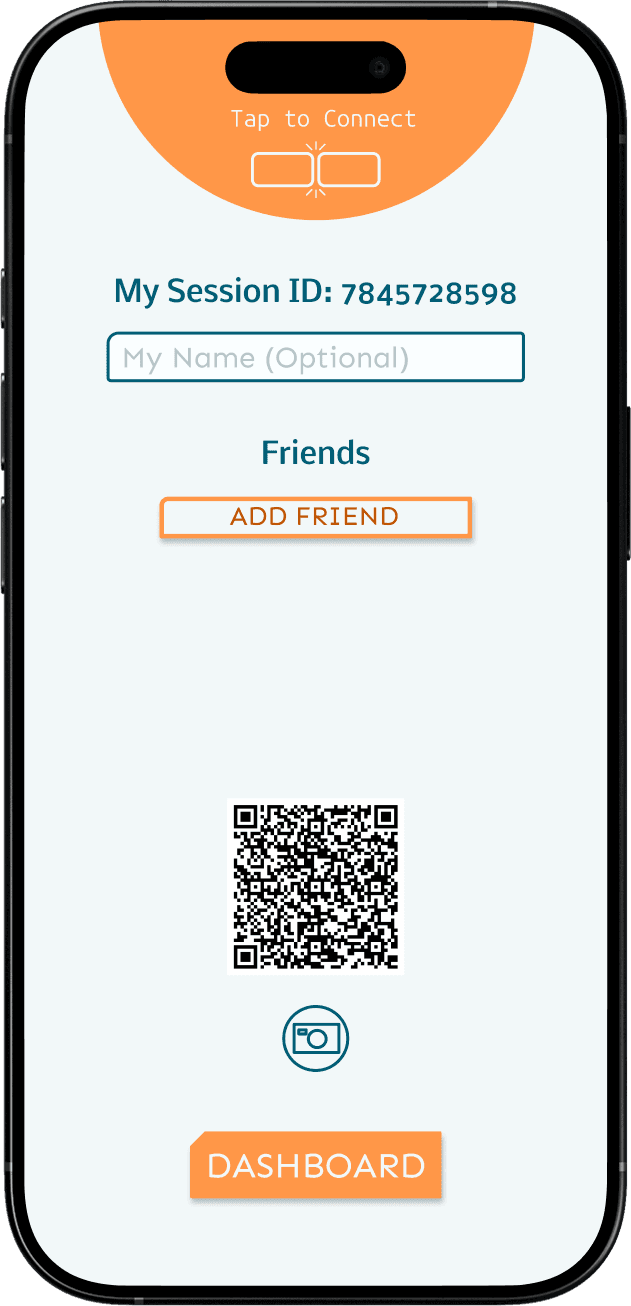
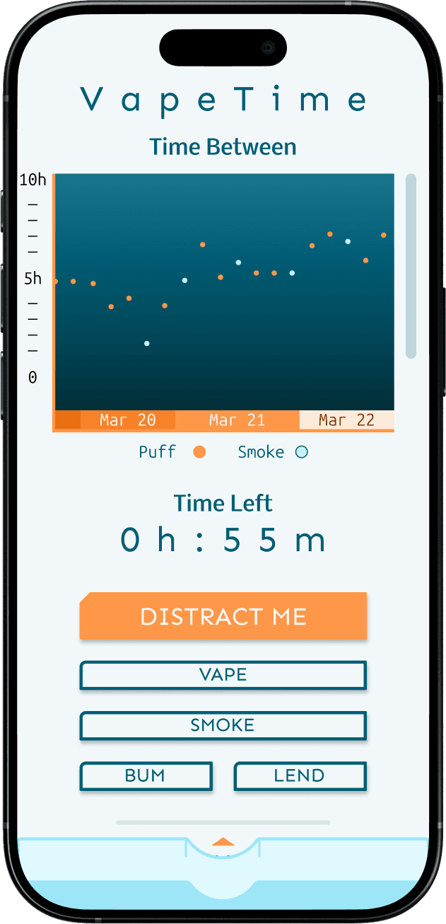


Smokers and Vapers looking to quit need a way to monitor their smoking and vaping habits that interrupts the craving, not everything else they're doing.
VapeTime provides users with easily accessible tracking widgets, and features to distract themselves when the craving strikes. An important part of the design is also non-judgement, emphasizing the importance of getting back on the bandwagon instead of shame for falling off.
The Problem
Smokers and Vapers need better tools and support systems in the quitting journey. This often results in lost motivation, succumbing to the cravings, and feeling alone and unsupported when they need it most.
The Goal
Smokers and Vapers need better tools that can remind them of their reason for quitting, provide distraction, and measure their habit objectively so that they can find the strength and motivation to achieve their quitting goal.
The Personas



The Color Palette, Typefaces, and Button Design
The VapeTime color palette is inspired by vapes and cigarettes — cool misty neutrals and orange that symbolizes a flame or the colored filter of a cigarette.
Primary:
Mist Gray
HEX: F2F8F9
Cool. Calm. A neutral color that also kind of takes the edge off.
Secondary:
Ocean
HEX: 005D75
Deep and soothing. A gentle grounding to the user to ease the itch that demands a scratch.
Tertiary:
Persimmon
HEX: FF9748
Energetic contrast provides cheerful distraction and resets the frame of mind.
Nobile
Medium
Sturdy and straightforward. Nobile provides the headers and informational hierarchy of the app.
Sen
Regular
Sen is used for body text and buttons, selected for readability and a clean aspect.

Primary Button
Primary buttons call attention with the accent color "Persimmon," a signature notched top-left corner, and solid fill.

Secondary Button
Secondary buttons match the background color scheme, have a rounded top-left corner, light fill and 4px stroke.
Initial Ideation


Six other mobile apps were compared in terms of features, accessibility, navigation, and overall brand identity and design. Surprisingly the "best" of competing mobile apps left a lot to be desired.
A small sample of current and former smokers and vapers were asked about their quitting journey and what motivations and methods actually helped them to kick the habit.
Three personas were built around the motivations and pain points of survey participants. In essence, what people wanted was a way to track their habit with easily accessible controls, defer gratification with simple distractions, and to have the support of friends on the same journey without losing control of ther privacy.
Usability Research, Insights, and Revisions


Both digital wireframes and an interactive protype underwent moderated usability studies to identify weaknesses in navigation, intuitiveness, and accessibility. Both rounds of user feedback were analyzed and grouped to then identify and prioritize changes to the design.
Primarily, issues identified centered around the verbiage for certain things and the generally large amount of new information on first launch. This was resolved with some new wording and the addition of introductory screens to guide new users.
Post Mortem


During wireframe testing it became apparent that not all official logos are instantly reconizable and clouds functionality. Custom iconography made the tap-to-connect (NFC) functionality more intuitive.
User were very confused about the word "Puff" because it could apply to both smoking and vaping and only applied to one in early designs. The solution meant changing actions in the app to "Smoke" and "Vape"
The app design around the distractions (minigames) was prototyped but not the minigames themselves, which would need to be built out to consider the project complete.
The initial user research for this app pales in comparison to the library of medical research around smoking habits. Additional research would be very helpful in identifying better ways of nicotine cessation and areas of improving future iterations of VapeTime.


